CSS Hacks & Creating Blogs
Table of Contents:

Solving Web Design Problems in a Clever Manner.
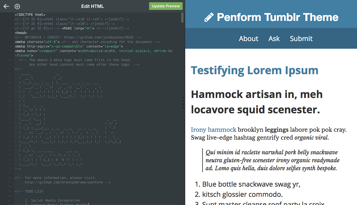
For the past week or so, I’ve been working on a blog theme for the popular platform Tumblr from scratch. It’s been a (mostly) fun experience, and I thought I’d share some things about web development that I learned along the way.
Now, to some it might be a bit silly to use a platform that’s well past it’s heyday — with its parent company Yahoo! being acquired by Verizon awhile back, and having a rather uncertain future.
The truth is that it’s more nostalgia than anything. I first got on the website five or six years ago, and tinkering with the layout was my first exposure to programming as a whole. With that said, I should note that all of these tips can be used in any web design and development!
Initial Limits
There are always advantages and limitations that come with using a third-party platform or content-management system. Tumblr provides you a single index.html document for your blog. This means that any sort of preprocessing, automation, or unit testing would have to be done externally. While this does limit workflow, it also forces a bit of creativity through simplicity.
Another disadvantage is that, by default, Tumblr blogs are bloated with external scripts, most likely for advertising and analytics. Because of this, I decided to limit myself to only using vanilla CSS for both styling and functionality. Adding additional JavaScript would have just made things slower than they already are.
That all said, Tumblr does provide decent documentation for creating custom themes, and have a pretty healthy marketplace. If you want to get started, they also partnered with GA Dash which offer a free course on the matter.
An Aside: Caution with Cleverness
HTML5 and CSS3 are built on top of rather ancient technologies.While a lot of new features work well, there are things that still require a bit of finesse and cleverness, particularly when trying to ensure backwards compatibility. (By that, I really just mean attempting to provide any sort of functionality in Internet Explorer.)
These tips I’m posting are hacks, in that they the code isn’t explicitly doing what it’s meant to do. It’s a workaround that’s needed because the foundations of current web technologies.
While this isn’t necessarily a bad thing, the trouble with cleverness is the need for documentation. You have to remember what exactly things are doing when they’re vague. Not to mention this is especially important when collaborating with others. In short: use comments and you’ll thank yourself later.
1. Debugging the Box Model Made Easy
A bug that I noticed early on was that, when viewing my website in mobile view, all of the content took up only right half of the screen, the rest being whitespace. I couldn’t make heads or tails at first, since the website appeared fine on larger displayed.
I had assumed that an element had an incorrectly set width, but nothing stood out at me in the styling. A quick Google search led me to this StackOverflow question with a near identical problem.
The answer Grey Li was simple and brilliant. A few lines of CSS to add to the end of your styling that would show how much space each element was taking up:
* {<br /> background: #000 !important;<br /> color: #0f0 !important;<br /> outline: solid #f00 1px !important;<br />}
2. Sidebars Made Easy
It can be tempting to utilize Bootstrap(link), or another grid-based CSS template when you’re first starting out, but the truth is that these templates are fairly bulky for small projects.
There are times where it’s far easier to just figure out what exactly you need and then code that by hand instead. For example, I wanted a sidebar for my blog. I sketched out what I wanted it to look like, then I wrote it out myself. It’s basic, but it’s also lightweight and uncomplicated.
With this demonstration, you could go a step further and add a bit of JavaScript/jQuery to make a hamburger button to give users the option to view it on mobile as well.
https://codepen.io/brennan/pen/MEOzKw
3. Clearfix
This hack is a bit of a relic of the past. Simply speaking, if all the elements (children) inside another element (parent) are set to float left or right, then the parent element’s height is reset to zero. (The cause of this can be read here: Containing Floats.)
Clearfix is a way to ensure that the parent element’s height is set to the correct height. It’s a method for an element to automatically clear children elements, so no additional markup is needed for tricky float or layout situations.
Nowadays, clearfix isn’t really needed thanks to the flexbox property, in fact even inline-block is an alternative to avoid this. But if you need to create a website that’s compatible with older versions of Internet Explorer, then this hack is still needed.
https://gist.github.com/brennanbrown/2c6e1edee3aafdb346c6d02c30bc3ae5
4. Border-Box Model Fix
There’s a lot more mathematics in CSS then people tend to realize. To determine the measurements of any element, five properties need to be accounted for:
- The initial width** and **height, which are used to set a specific size for the content box.
- The padding, which adjusts space inside the element.
- The margin, which adjusts space outside the element.
- And the border, which displays between the padding and margin of the element.
The way these properties are formulated together to calculate the total size of the element is the box model. (Note: Inline elements do take padding and margin values, it will only push the other elements out horizontally, not vertically.)
By default, all elements are set to box-sizing: content-box;.
When in this state, margin adds space around the element, but does not affect the size of the element. But padding and border will increase the total size of the content box.
However, changing the value from content-box to border-box will include both the padding and border when calculating the total width and height of the element.
What does this mean? With border-box, if the width and height values are 400 by 200 pixels, the element will remain the same size because the padding and border actually pushes inward, making the content area smaller. The content box will stay the same size.
So what’s the easiest way to change all the elements in a document to border-box? Well, the credit to this hack goes to Paul Irish, you can read more about this on his blog post.
Similar to debugging the box model, add the following to the end of your stylesheet:
https://gist.github.com/brennanbrown/fc9676c52124bcafa8b6619ee592e936
Bonus Tip: Use Emmet
This has nothing to do with workarounds, and more to do with becoming much more efficient when writing HTML and CSS.
Emmet is a plug-in that is available for a multitude of different IDEs and editors. It adds a lot of functionality, and has a bit of a learning curve. What I use it mostly for is quickly writing up HTML mockups.
For more information, visit their documentation and cheat sheet.
A quick example: In my second tip when I was creating the sidebar example on Codepen, I wrote out the following:
doc>header>h1{Website Title}+nav>a*3^^hr+aside#sidebar>h2{Sidebar Title}+p>Lorem^^main#blog>article.post(h1{Post Title $}+div.post-body(p*2>Lorem))*3
Emmet takes that shorthand, and converts it into the following:
https://gist.github.com/brennanbrown/153f8617f3aa5219c4105602d8650db8
The Result?
If you’d like to see the source code for the blog project I’m working on, or even use it, you can view the GitHub repository which contains instructions on how to use it. Be warned, it’s not finished! There’s also a demonstration blog, as well as my main Tumblr, where I’m currently using the theme.
Thanks for reading!